
Choosing a paint color for your living room is one of the most impactful — and most agonizing — decisions in home decor. A single wrong color can make a bright room feel like a cave, or a cozy space feel like a waiting room. But get it right, and the entire atmosphere of your home shifts.
In 2025, the dominant trend is moving away from cold grays and stark whites toward warm, earthy, layered palettes that feel grounded and human. Here are the 12 best living room color ideas working right now — with designer tips on how to use each one.
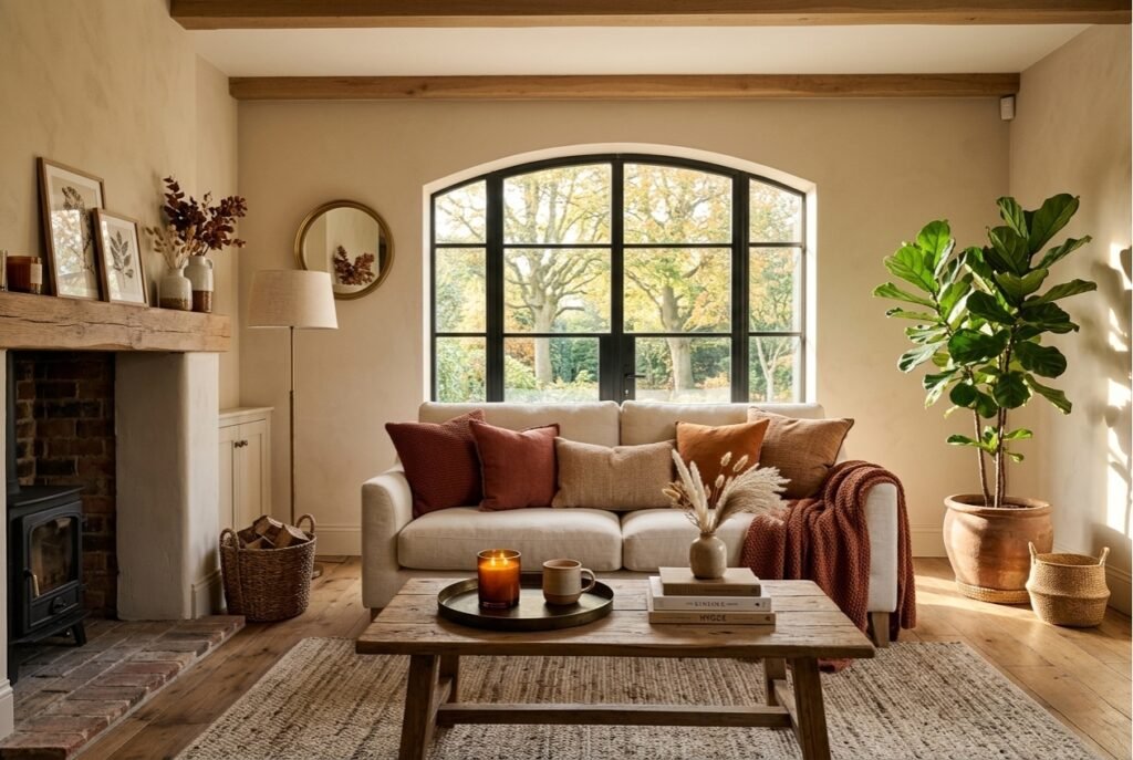
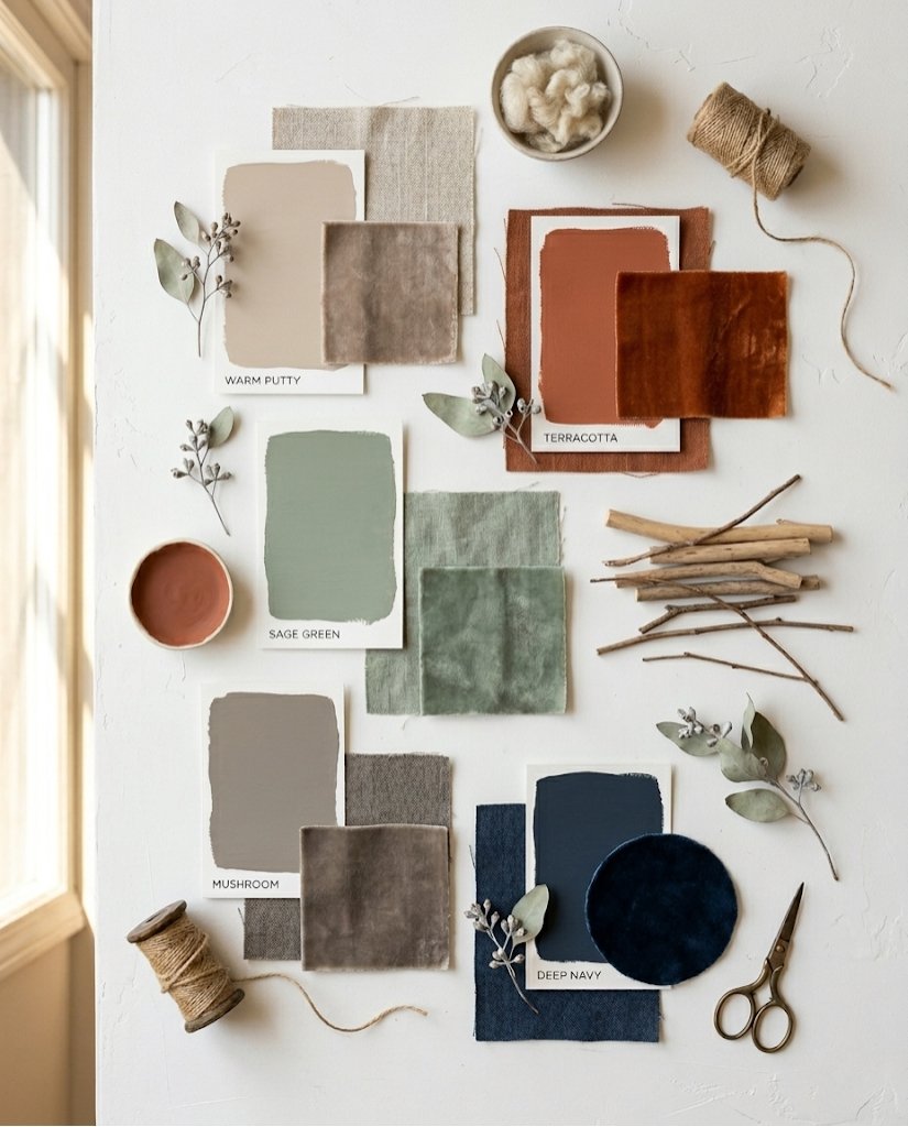
1. Warm Putty — The New Greige
The dominance of cool gray is officially over. Warm putty — a creamy, pinkish-beige that sits between cream and taupe — is the new neutral of 2025. It reads warm in natural light and almost like a blush at night. Paint picks to look for: Benjamin Moore ‘Pale Oak,’ Sherwin-Williams ‘Accessible Beige,’ or Farrow & Ball ‘String.’
Best for: Rooms with limited natural light that need warmth without feeling dark.
2. Terracotta and Clay
Nothing says cozy like the warm, earthen tones of terracotta. This color pairs beautifully with natural linen, rattan furniture, and warm wood tones. It’s perfect for a bohemian, earthy aesthetic and particularly effective as an accent wall in a neutral room. Don’t go too orange — look for the muted, dusty versions that read more “Italian villa” than “Halloween.”
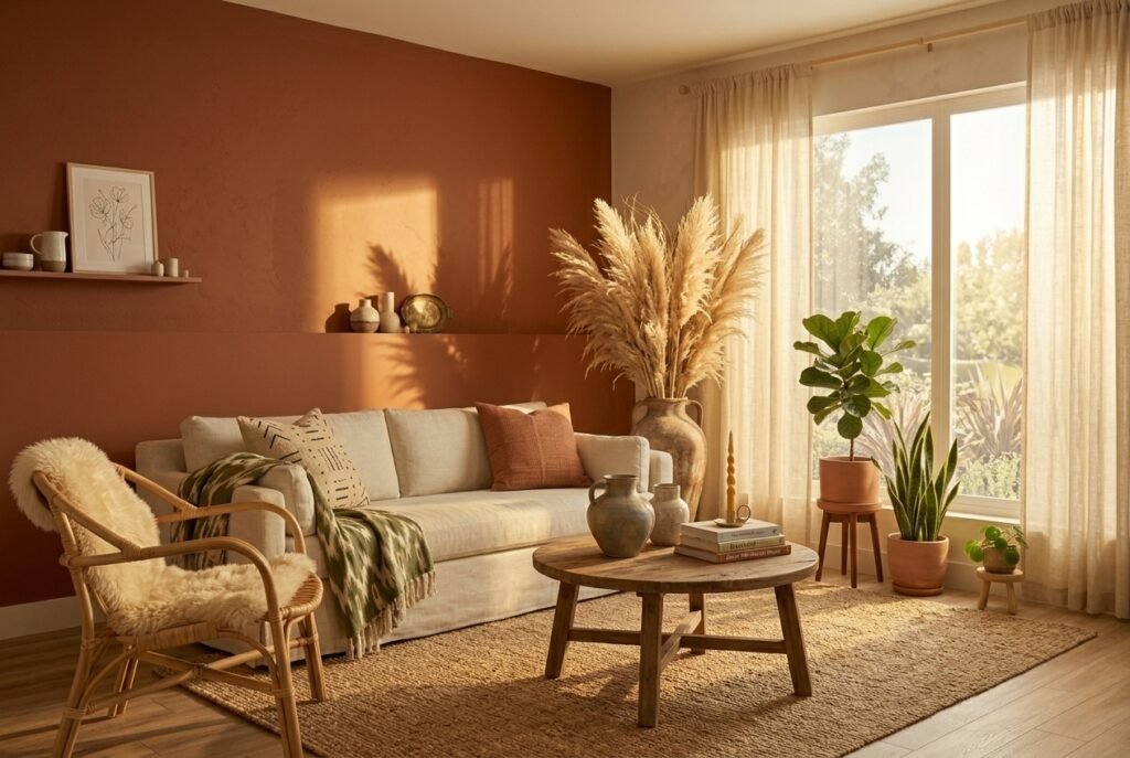
Pairs with: Cream, warm white, olive green, natural wood, rust.
3. Sage Green
Sage green has been trending for three years and shows no signs of stopping — because it genuinely works in almost every light condition. It’s calm, nature-adjacent, and surprisingly versatile. The key is choosing a sage that leans warm (yellow-green undertone) rather than cool (blue-green undertone) for maximum coziness.
Best application: All four walls in a small living room, or as an accent wall behind the main sofa.
4. Deep Forest Green
For those who want drama and depth, deep forest green is having a massive moment. It’s moody and sophisticated, but unlike dark blues or blacks, it retains an organic, natural quality that prevents it from feeling heavy. Use it on all four walls with warm brass hardware, cream trim, and lots of candlelight for maximum impact.
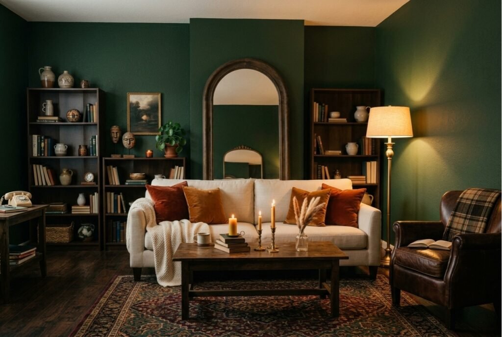
Important: This color requires at least one large window or multiple light sources to avoid feeling oppressive.
5. Warm White — Not Stark White
Many people default to ‘white’ without realizing that not all whites are equal. Cool whites (like pure brilliant white) reflect blue light and can make rooms feel cold and clinical. For a living room, always choose a warm white — one with cream, yellow, or red undertones. Look for: Benjamin Moore ‘White Dove,’ Farrow & Ball ‘Pointing,’ or Sherwin-Williams ‘Alabaster.’
6. Navy Blue
Navy is the ultimate sophisticated neutral. It creates a cocooning effect in living rooms, making large open spaces feel intimate and connected. Despite being dark, navy reflects light beautifully and pairs well with gold, brass, cream, and natural wood. Use it on all walls with bright white trim for a classic, high-contrast look.
7. Warm Caramel and Honey
Inspired by the resurgence of warm wood tones, caramel and honey paint colors bring the energy of natural wood grain to your walls. These work exceptionally well in rooms that already have white trim and ceilings, creating a layered, warm envelope effect. They’re particularly effective in home offices and libraries that want a scholarly, intimate feel.
8. Dusty Mauve and Blush
Soft, dusty pinks and mauves have transcended the “millennial pink” trend and matured into genuinely sophisticated living room colors. The key is choosing muted versions — not hot pink or bubblegum, but the kind of blush that reads almost like a warm neutral at arm’s length while revealing its pink nature up close.
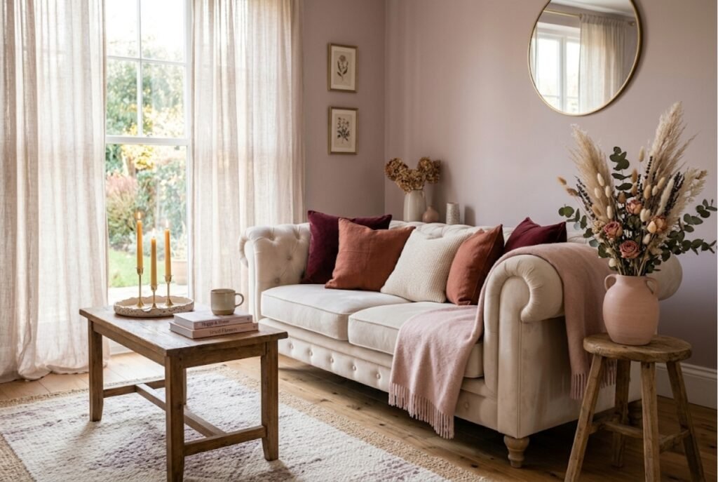
Styling tip: Pair with deep burgundy accents, warm wood, and cream to anchor the softness.
9. Mushroom and Greige
Mushroom is the color of 2025 — a warm, muted brownish-gray that’s neither brown nor gray but the perfect mix of both. It’s the most forgiving neutral because it works with warm and cool tones simultaneously. Particularly effective in open-plan spaces where you need a color that bridges kitchen and living room without clashing with either.
10. Burnt Orange as an Accent
Burnt orange is too powerful for full rooms, but as a single accent wall or for furnishings, it’s one of the most transformative colors available. It immediately adds energy, warmth, and personality to neutral spaces. A burnt orange velvet sofa or a single terracotta-painted alcove can be the statement piece that ties an entire room together.
11. Cream and Off-White with Warm Undertones
For those who want bright but not stark, warm cream is the answer. It reads as white in photographs but adds unmistakable warmth in person. Unlike the cold, sterile quality of pure white, cream feels luxurious and timeless. It’s the dominant color in virtually every aspirational living room you’ve ever seen on Pinterest.
12. The 60-30-10 Rule: How to Combine Any Colors
Whatever palette you choose, the professional formula for combining colors in a living room is the 60-30-10 rule:
- 60% — your dominant color (walls, large sofa, main rug)
- 30% — your secondary color (curtains, armchair, large cushions)
- 10% — your accent color (throw pillows, vases, candles, small decor objects)
This ratio creates visual balance regardless of which specific colors you choose. The 10% accent is where you can take risks with bold colors without overwhelming the space.
Final Thoughts: How to Choose the Right Color for Your Room
Before committing to any color, always test a large paint swatch (at least A4 size) on your actual wall and observe it at different times of day — morning, midday, and evening with lamps on. Colors shift dramatically with changing light, and what looks perfect at 2pm in bright sunlight can look completely different at 8pm under warm lamp light. The 10 minutes this takes will save you from an expensive mistake.
Ready to take the next step? Check out our guide on how to make a room look cozy for even more ways to transform your living room — without a renovation budget.
Save this post and share it for more home inspiration! Follow us on Pinterest @MyCozyNestFinds for more affordable home ideas.

